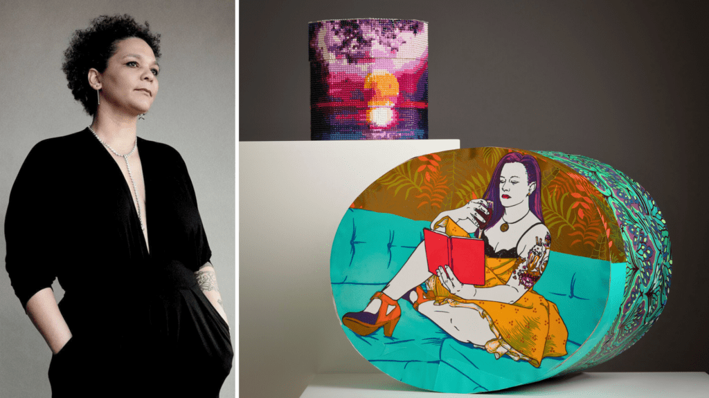
Search Site

Judith Solodkin

About the Artist

Bronx, New York

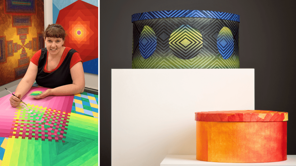
Judith Solodkin received a master of fine arts degree from Columbia University in 1967, has taught art on the college and graduate level, and is teaching lithography, digital embroidery, and soft sculpture at the School of Visual Arts and lithography at Pratt Institute. She also studied millinery at Fashion Institute of Technology and is a member of the Milliners Guild. She was the first woman to graduate from the Tamarind Institute as a Master Lithographer in 1975. Today she is based in Riverdale, Bronx, New York, and operates as a print publisher and contract printer—SOLO Impression, Inc.  Innovative collaborative techniques have been a mainstay of SOLO Impression. Judith continues to collaborate with artists on fine art lithography, embroidery, and fabrication. 

A trailblazing supporter of women in the arts since the mid-1970s, Judith developed an “old girls’ network” with the same rigor and opportunity afforded male artists. In 1996 and 2010, the retrospective The Collaborative Print: Works from SOLO Impression was presented at the National Museum of Women in the Arts in Washington, D.C. In 2013, she received a Printer Emeritus award from the Southern Graphics Council International. Taschen Publishing commissioned three lithographs by Françoise Gilot in 2017, and “Ode à l’oubli,” a collaboration with Louise Bourgeois, was exhibited in An Unfolding Portrait at the Museum of Modern Art in 2018. In November 2020, she was honored by the International Print Center of New York for her printmaking achievements. SOLO Impression exhibits at the International Fine Print Dealers Association Print Fair. Editions by SOLO Impression are in the Museum of Modern Art; The Metropolitan Museum of Art; Whitney Museum of American Art; New York Public Library; Museum of Fine Arts, Boston; Library of Congress, National Gallery of Art; Bibliothèque Nationale de France; and Tate Modern in London.  

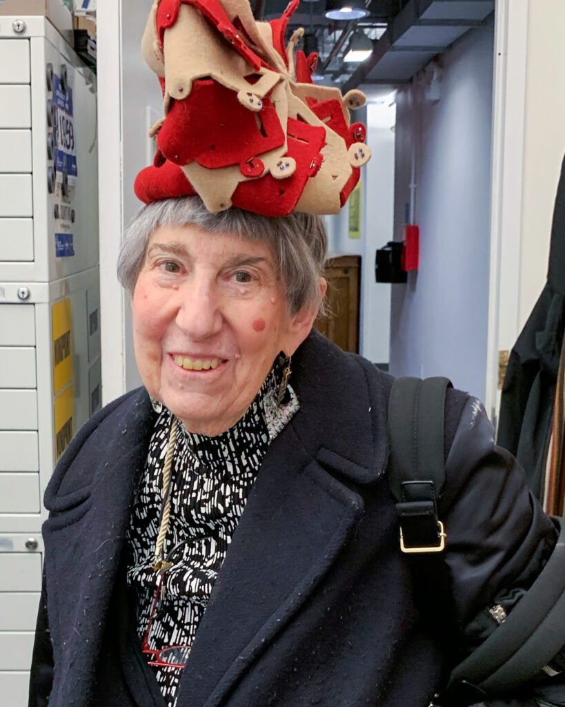
Judith is known for her handmade hats, which she proudly wears herself. Hats from SOLO Chapeau were recently shown at the Metropolitan Museum Mezzanine Art Gallery and at the Garment Center’s 38th Street Window during Textile Month, and they have been featured in online exhibitions of the Milliners Guild. 

Website: SoloImpression.com
Social Media: @JudithSolodkin

Artist Statement 

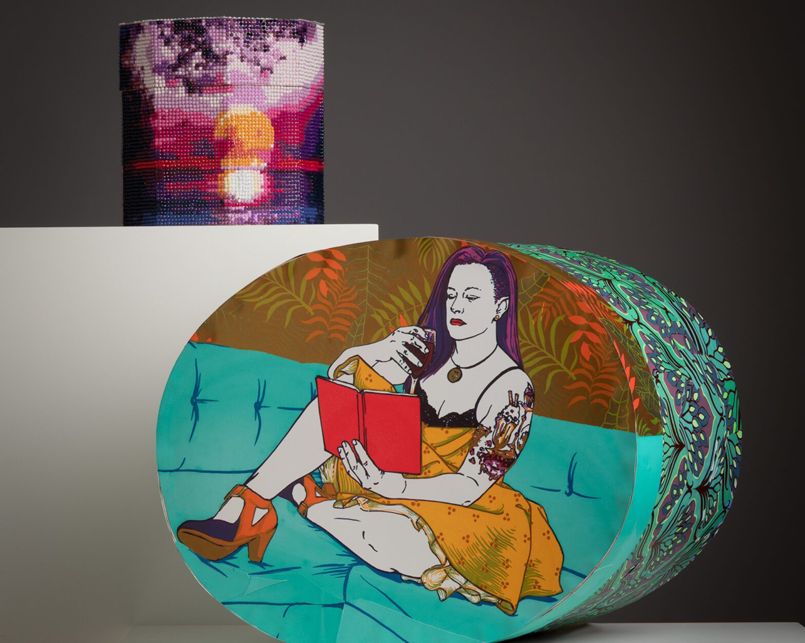
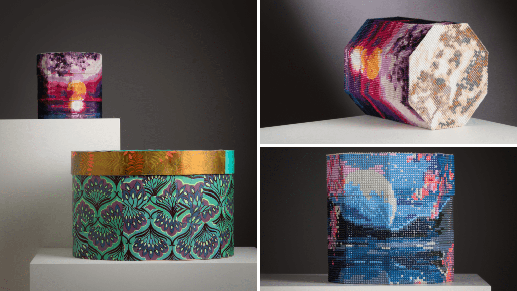
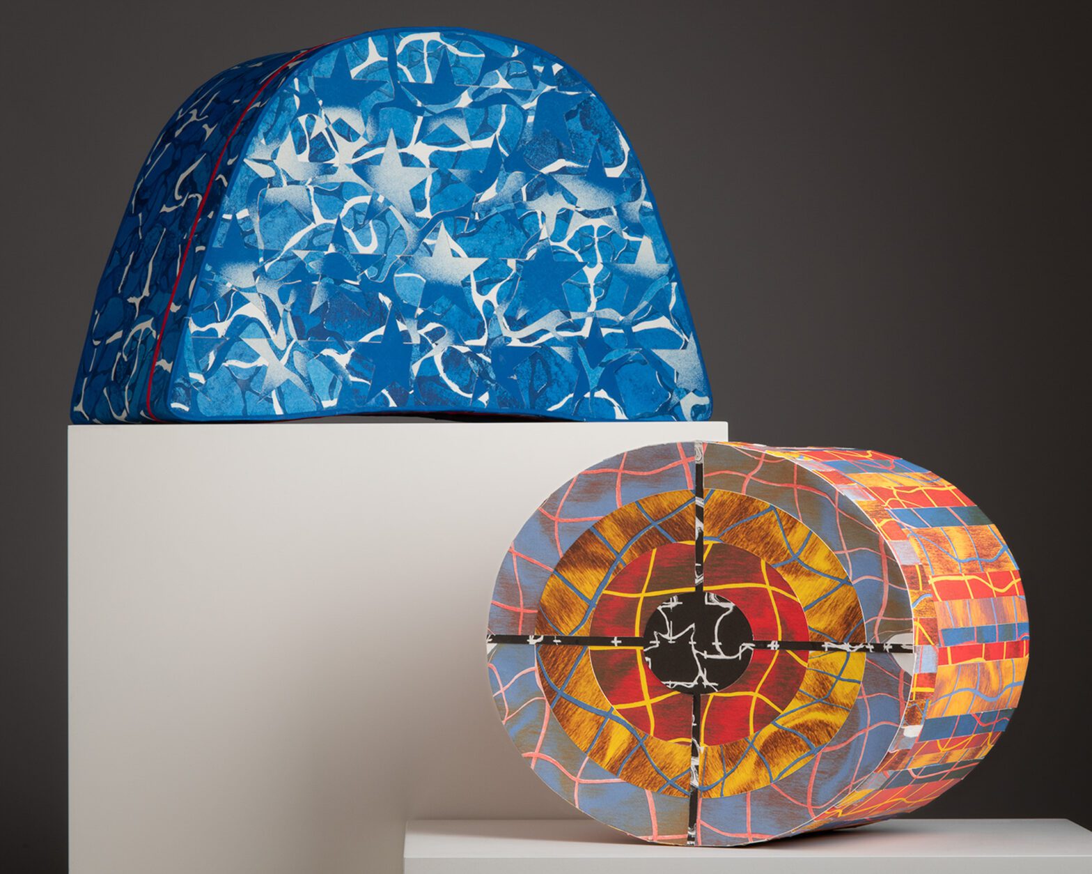
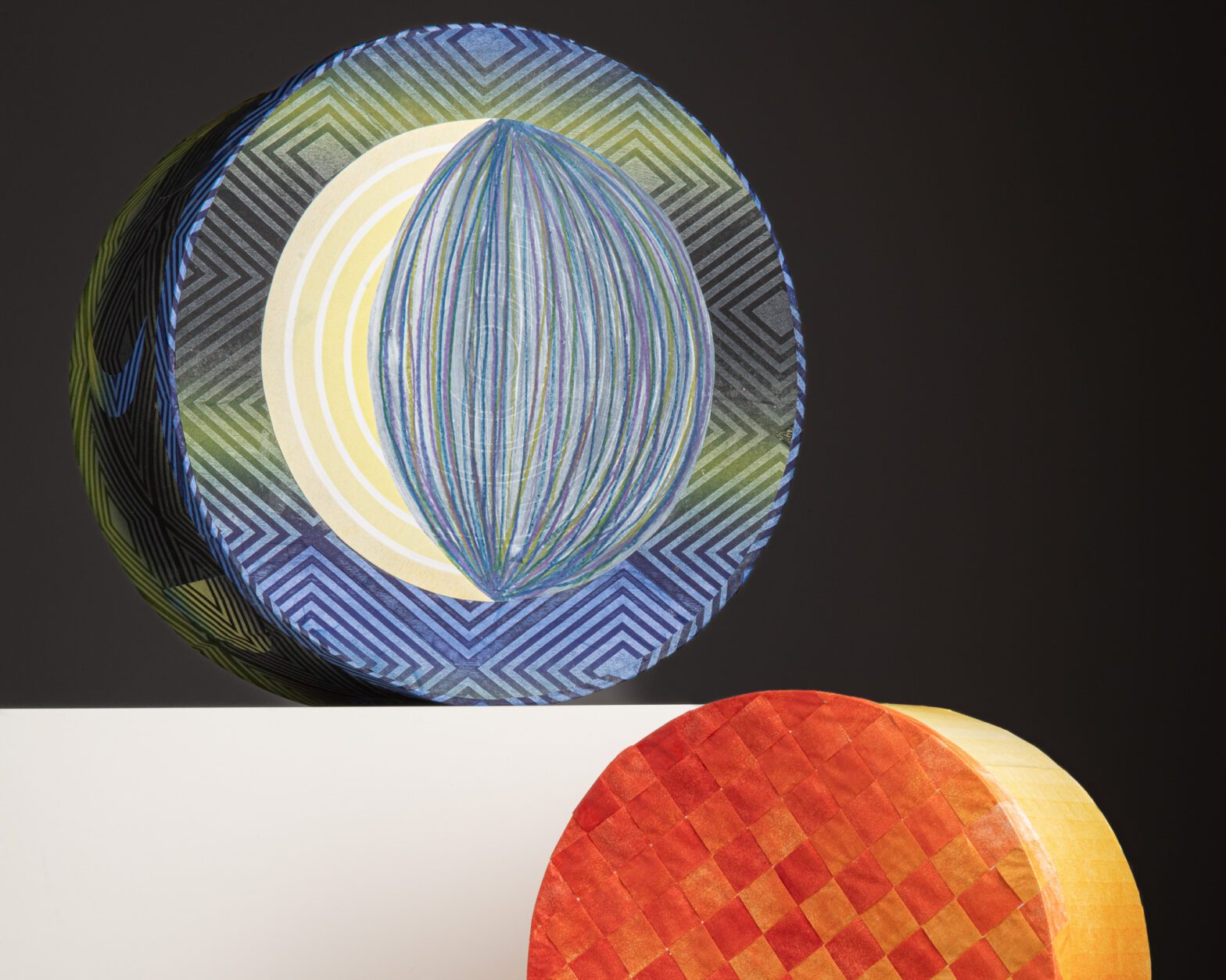
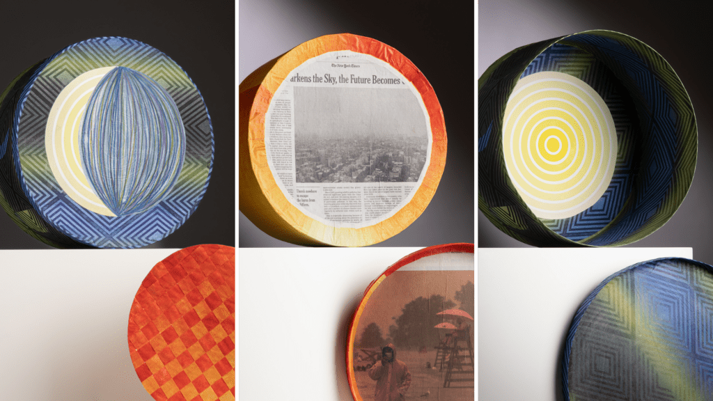
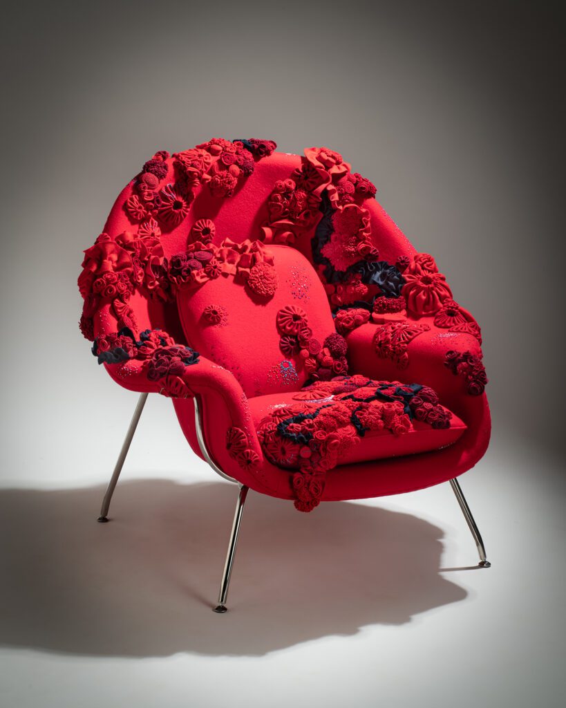
Referencing history has always been a part of my activities, whether at SOLO Impression collaborating with artists in fine art lithography, in digital embroidery, or in creating hats under the SOLO Chapeau label. Teaching at the School of Visual Arts and Pratt Institute is a catalyst to expose students to precedent and to past knowledge and early hand-manipulated techniques. These skills are vital in the collaborative process with artists, directing them forward to the future. For example, in my print “Whitfield Lovell,” I appropriated an early wallpaper design in his twin lithographs, “Barbados and Georgia” (2009) and combined it with stone lithography and inkjet printing. And I embroidered a restoration fabric from an 1860 motif that was used as the upholstery on a chair showing at the Brooklyn Museum as part of Modern Gothic: The Inventive Furniture of Kimbel and Cabus, 1863–82. 

I continue to be fascinated by early tools that when mastered in the present can yield new results. Old presses, rollers, stones for lithography and head blocks and forming tools for millinery can be updated with new technologies for surprising effects. My new fabric inkjet printer allows me to print images on cloth and subsequently to embroider the results, as I did with the banner of Judy Chicago, “What If Women Ruled the World?”  

Katie Commodore

About the Artist 

Providence, Rhode Island

Despite years of her insisting that their daughter was going to be an astronaut, Katie Commodore’s parents could have told you that she would grow up to be an artist—even as they sent her to Space Camp, twice. Never giving up her dreams of painting Martian landscapes and testing low gravity pastels, she attended Maryland Institute College of Art, which, not surprisingly, lacked the rigorous science background NASA required. After graduating, she spent time abroad in Paris, Prague, Greece, plus a short stint in Las Vegas. She returned to school, earning her master of fine arts degree in printmaking from Rhode Island School of Design, where, as well as at Clark University (Worcester, Mass.) she is now an adjunct faculty member. Katie now resides in Providence. 

Website: KatieCommodore.com
Social Media: @KatieCommodore

Artist Statement

I always wanted an octagon house, there is something magical about them. They are at the top of my homeowning bucket list. But currently, it’s just a dream. So, instead, I thought about creating an octagon-shaped hope box. The interior is lined with pieces of a roll of original wallpaper I found in the attic of a Victorian that I owned, The George Jepherson House. Originally, it was supposed to represent my present, now it stands for my recent past, pain, failure, and success. A dream realized but cut short. The exterior is made up of several “5D Diamond Painting” kits—sort of modern versions of paint-by-number art. I imagine a young girl today putting together a hope chest and decorating it to match her room. She would use a modern, cool crafts kit that she got from Michael’s™. She’d spend days working on it, and it would make her so proud to show off. I spent days sticking down thousands of rhinestones, meditating on my hopes for the future. Not just the hopes of an octagon house, but for financial stability, calm, time, and breath. I hoped for my life and happiness back. It may not be a chest of my future linens and household needs for my future married life—I’ve already gotten all those things. This is a box of just plain hopes.  

The second box is papered with the patterned backgrounds from several of my prints. The figure, a friend named Julia, seems to be waiting for something to start—a party, a date to arrive, something exciting. She’s all dressed up and waiting to go. . . somewhere. Again, it’s full of hope. The hope that today will be worth getting dressed up for, the hope that you don’t get stood up, the hope that it’s all going to be fun, the hope that this book is worth reading.  

Two boxes of hope. When you open them, one smells of the crumbing past and the other is the blank of the future; both are filled with only air and dreams.  

Maxime Jean Lefebvre

About the Artist

Providence, Rhode Island

Maxime Jean Lefebvre is an interdisciplinary artist who works mainly with printmaking and ceramics. His work explores the tension between histories, stories, and systems of power and is informed by his personal experiences as a foreigner in America.   

Born and raised in France, Maxime has been living in the United States since 2017 in Providence, Rhode Island. He holds a master of fine arts degree in printmaking from the Rhode Island School of Design and a diplôme national d’arts plastiques (bachelor of fine arts degree) from the École Nationale Supérieure d’Art de Bourges. 

Website: MaximeJeanLefebvre.com
Social Media: @MaximeJeanLefebvre

Artist Statement

I was surprised to learn that many Americans are still obsessed with Napoléon and the heroic tales that surround his tumultuous life. Was it his rapid ascension to power? The self-coronation? The comeback to Paris from Elba Island? Or perhaps Elon Musk is more fascinated with his profound disdain for democracy, his systematic oppression of political opponents, and the vertiginous death tolls his campaigns inflicted.  

An Escape? is a box for Napoléon’s last tricorn, the one he wore while looking at the waves crashing on the shore of Saint-Helena, wondering if he could have a fresh start in the New World.  

Easy Targets is a hatbox made for a standard Advanced Combat Helmet issued by the American military. The military in the United States is structured as a fascinating blend of authoritarian hierarchy and a social welfare state. The only way a lot of Americans can access good, affordable healthcare, tax-free housing allowance, and generous tuition aid is through enlisting and accepting the ultimate trade-off. The basic structure of many developed countries is used as bait and has progressively become one of the last remaining bastions for the middle class, where service members don’t go broke due to a medical bill. 

Julia Samuels

About the Artist

Providence, Rhode Island 

Julia Samuels was born in Portsmouth, New Hampshire, and she earned her bachelor of fine arts degree in printmaking from Pratt Institute in 2007. In Brooklyn, she participated in founding the Gowanus Studio Space, providing a community gathering point and accessible studio spaces to artists, as well as 596 Acres, which helps residents navigate earning legal access to public lands in their neighborhoods. Samuels earned her master of fine arts degree in printmaking from Rhode Island School of Design in 2015, after which she founded Overpass Projects, a fine art print publisher committed to innovating contemporary printmaking techniques as well as amplifying underrepresented voices. At Overpass Projects, Samuels publishes her own work as well as collaborative editions that have been acquired by several collections, including the National Gallery of Art, Library of Congress, Los Angeles County Museum of Art, and Ford Foundation. 

Websites:

Social Media: @OverpassProjects

Artist Statement 

Intricacy and beauty can be found anywhere, and I see art everywhere I go—at every traffic stop or speeding by on the highway, in the whole built-up world around us, and in every interaction where the natural world is attempting to reclaim its space. Power lines, phone cables, chain-link and barbed wire fences are things we all encounter on a daily basis and most likely do not consider beautiful. I appreciate the challenges these elements bring to the medium of woodcut. Cables and wires silhouetted against a clear sky are elements positively drawn over deep negative space, and in carving I invert this relationship, investing my effort into the areas carved away, the blank spaces. My discipline and care are leaving behind, and untouched, the intention of the original artwork, that fence, cable, tree, or vine that exists in the real world. 

Amber Heaton

About the Artist

Brooklyn, New York

Amber Heaton creates colorful, geometric installations, mixed media works, paintings, and works on paper. She received an master of fine arts degree in printmaking from the Rhode Island School of Design in 2012, a bachelor of fine arts degree from the University of Utah in Printmaking and Sculpture in 2009, and a bachelor of university studies in Human Diversity from the University of Utah in 1998. Her work has been exhibited at The Bronx Museum of the Arts; Children’s Museum of Manhattan; Susquehanna Art Museum; International Print Center New York; Highpoint Center for Printmaking; Musée Des Beaux-Art, Le Locle, Switzerland; and other venues internationally. In 2019, Heaton had solo exhibitions at Cedar Crest College in Allentown, Pennsylvania, and Narrows Center for the Arts in Fall River, Massachusetts. Heaton participated in the AIM Program at the Bronx Museum of the Arts, was a scholar at the Center for Book Arts, New York, and an artist-in-residence at Wassaic Project, New York. She was awarded a Fulbright Fellowship in South Korea from 2001–2003. Heaton lives and works in Brooklyn, New York. 

Website: AmberHeaton.com
Social Media: @AmberHeat

Artist Statement

Like Byzantine architecture and mandala drawings, my work lies in the tradition of creating spaces that embody the sensation of the sacred or mystical. The rhythms of light and time visible in the natural world shape my sense of space and provoke my work. I learn to observe shifting states of balance and harmony from nature. For me, these states are spaces of personal freedom and democracy. In each artwork, I invite the viewer to seek tranquility and equality. 

I create colorful, geometric paintings, mixed media works, installations, and works on paper. I layer transparent washes over wood panels and sculptures to illuminate areas of pattern. I use line to form depth, sometimes adding string, tassels, and hardware to build layers of 3-dimensional space. These elements visually reinforce data points in the systems I formulate. I base these systems on mathematics and data concerning the natural world and our universe. 

With influences from Euclidean diagrams to Minimalism and textile art, I construct patterns with a sense of vibration, establishing a physical relationship to the eye and the body. I play with relationships between the physical and the metaphysical. Using scale, abstraction, and repetition, I devise spatial relationships with psychological tension and release. These psychological spaces give me room to consider human interactions in a visual way, and my geometries become metaphors for those interactions. Compositionally, I want each work to come to a state of equilibrium and to emanate a sense of calm and openness. 

Gregg Moore and Omar Tate

About the Artist: Gregg Moore

Gregg Moore is an artist, designer, and educator. His studio practice explores the relationship between ceramics and new media, drawing from historical foundations while questioning and investigating perceptions of the ceramic field. His current work ranges from ceramic tableware, mixed media sculpture, and multimedia installation that examines the practices of gardening, farming, cooking, and eating. His professional practice is shaped by collaborations with chefs, scientists, curators, and artists. Moore is professor of Visual and Performing Arts at Arcadia University, where he directs the Ceramics program. 

Website: GreggFMoore.com
Social Media: @GreggFMoore

About the Artist: Omar Tate

Philadelphia, Pennsylvania

Identifying first and foremost as an artist (not a chef) who uses food as one of his many mediums, Omar is a West Philly native who worked for over a decade in acclaimed kitchens across Philadelphia and in New York City before embarking on his own. After experiencing a lack of diversity and representation, both in the kitchen and on the plate, Omar launched Honeysuckle Projects to tell nuanced stories on Blackness in America. You can find Omar’s work featured in The New York Times, Esquire Magazine, Okayplayer, Eater, The Philadelphia Inquirer, and other publications.  

Website: HoneysucklePhl.com
Social Media: @Coltrane215

Artists’ Statement

Our project, ˈȯi-stər, builds on our previous collaborations to connect people in conversations about nourishment, community, and Black craft through processes of making, growing, and eating. ˈȯi-stər · ve-səl consists of 100 hand-thrown porcelain jars, hundreds of porcelain oyster shells, a single large-scale water vessel, and a stoneware jar by Thomas Commeraw from the Winterthur museum collection. The project explores histories of taste, cultivation, trauma, and joy and reclaims and reimagines oysters as sources of sustenance, facilitators of memory-keeping, and poetic expressions of identity. 

Jerome Bias

About the Artist

Graham, North Carolina

Jerome Bias is a furniture maker and cultural heritage practitioner, specializing in the reproduction of early Southern furniture using period techniques. He has been making furniture since 2000. 

As the hearth cook with the Slave Dwelling Project during on-site programs, he learned to ask complicated questions, like: What were the skill sets of enslaved tradespeople? How did they craft lives for themselves and their families while enslaved? 

Bias currently makes reproductions of furniture from places where his family was enslaved. He is exploring the question: How did his ancestors handle the trauma of enslavement and yet maintain the ability to have hope and love? 

Website: JeromeBias.MyPortfolio.com
Social Media: @JeromeFBias

Artist Statement 

Hope and Love. How do we see the ancestors? It is easy to see them through a lens of pain and suffering. In this project I look at them through a lens of hope and love. I sit in amazement at the courage it took for a mother to love her daughter knowing that if the crops failed, her baby girl could be sold to pay a debt. In this project, “What does that love look like?”  I ask the question, what kind of generational trauma comes out of that experience? 

We don’t know the names of many of the ancestors, and we have very few of their stories. But from research we know that we have artifacts that were witnesses to their lives. They were there while they lived their lives. They were the items that they used every day. They were the items that they bought to express themselves. They were the items that they bought to make life possible. 

As a people forged in the bitter fire of American slavery, what does hope and love look like? Is it the resplendent coconut cake that was made by an auntie and would have graced this hunt board? Is it the oversize tree nails that hold the hunt board together while also fracturing the frame? What do you keep and pass on to the next generation?  What do you find a new healthier version of?  These are the questions that I am exploring through the building of the Georgia hunt board.

Lauren Frances Adams

About the Artist

Baltimore, Maryland

Lauren Frances Adams is a painter and installation artist whose work has been widely exhibited in public venues, such as artist-run spaces, historic houses, university galleries, and museums, including at the North Carolina Museum of Art, the Warhol Museum, Baltimore Museum of Art, and the Contemporary Art Museum St. Louis. She holds degrees from UNC-Chapel Hill and Carnegie Mellon University and attended the Skowhegan School of Painting and Sculpture. She is the recipient of awards from the Joan Mitchell Foundation, the Pollock-Krasner Foundation, and the Trawick Prize. She has participated in residencies at the Joan Mitchell Center and Sacatar Foundation in Brazil. Lauren lives in Baltimore and teaches at Maryland Institute College of Art. 

Website: LFAdams.com
Social Media: @LaurenFrancesAdams

Artist Statement

My work explores political and social histories through iconic images and domestic ornament, rooted in my experiences growing up on a farm in the American South and inspired by my belief in the need for reckoning with the past to understand the present and shape the future.

Battling Algae with a Splash of Color

Beneath the serene surface of Winterthur’s ponds, an unexpected sight catches the eye—vibrant flashes of orange. Except in our two picturesque koi ponds, these colorful flashes are unlikely to be fish. Rather, they are part of a pioneering initiative aimed at taming algae proliferation across the nearly 1,000-acre estate.

Kevin Braun, supervisor of arboriculture and natural lands at Winterthur, and his team put barley hay into orange-colored onion bags and anchored them to cinder blocks. The buoyant bags hover about six inches below the ponds’ surface.

That makes them easy to spot.

Orange bags of barley hay can be seen below the surface of ponds at Winterthur as part of a new attempt to stop algae growth.

“The idea is that as the hay breaks down, a chemical reaction happens that will hopefully stop algae growth,” Braun explained. “The bags need to be exposed to the sun to decompose, which is why they cannot be too deep.”

The Penn State Extension says barley straw doesn’t kill existing algae but appears to inhibit the new growth of algae.

“The exact mechanism is poorly understood, but it seems that barley straw, when exposed to sunlight and in the presence of oxygen, produces a chemical that inhibits algae growth,” according to the Extension. As part of Penn State, the Extension delivers unbiased, scientifically proven, evidence-based information to individuals, businesses, and communities anywhere.

So… is this method working at Winterthur?

The air and water temps are still too low for us to know.

We’ll check back later in the season!

Kirin Joya Makker

About the Artist

Geneva, New York

Kirin Joya Makker is professor of American Studies at Hobart William Smith Colleges. An artist trained as an architect, and a scholar in critical space theory, Makker works to bridge disciplines and their methods of producing knowledge. At her institution, she teaches courses which investigate social power and architectural spaces. She combines traditional scholarship with creative practice in hand drawing, sewing, and installation art. Her research on these topics takes several forms, including designing and leading participatory art projects, exhibiting solo artworks, and producing scholarly writing on women’s history and black history in design and urban planning.  

Website: WombChairSpeaks.net
Social Media: @KirinMakker

Artist Statement

Dubbed the “Womb” chair at a 1948 press event after a journalist spotted a pregnant woman sitting in it, the Knoll Womb Chair was gendered, racialized, and sexualized from its public debut. In the decades that followed, it appeared regularly in corporate office and bachelor pad plans and was uniquely promoted by Playboy magazine as a signature prop in objectifying women, emphasizing male fantasies of compliance, titillation, and repose. The Womb Chair Speaks project works to resist this context of constraint, its cultural history, and characterization of the womb by placing a manufactured Womb Chair into community sewing circles for regular stitching sessions. By (re)establishing a connection to women’s domestic labor history, this project repositions the Womb Chair away from conventional male space and into a subjective and shared learning space, where folks engage in kinetic dialogue, personal narrative, and collaborative labor. The project politicizes the medium of upholstery, the act of stitching, and the traditional forum of the sewing bee in feminist community work. In this form, the Womb Chair (and womb) may resist patriarchal constraint and speak.